
This article looks at the 10-year Treasury yield’s historical trends since 1962, exploring its relationship with key economic indicators like the Fed Funds Rate (FFR), inflation, and the S&P 500.
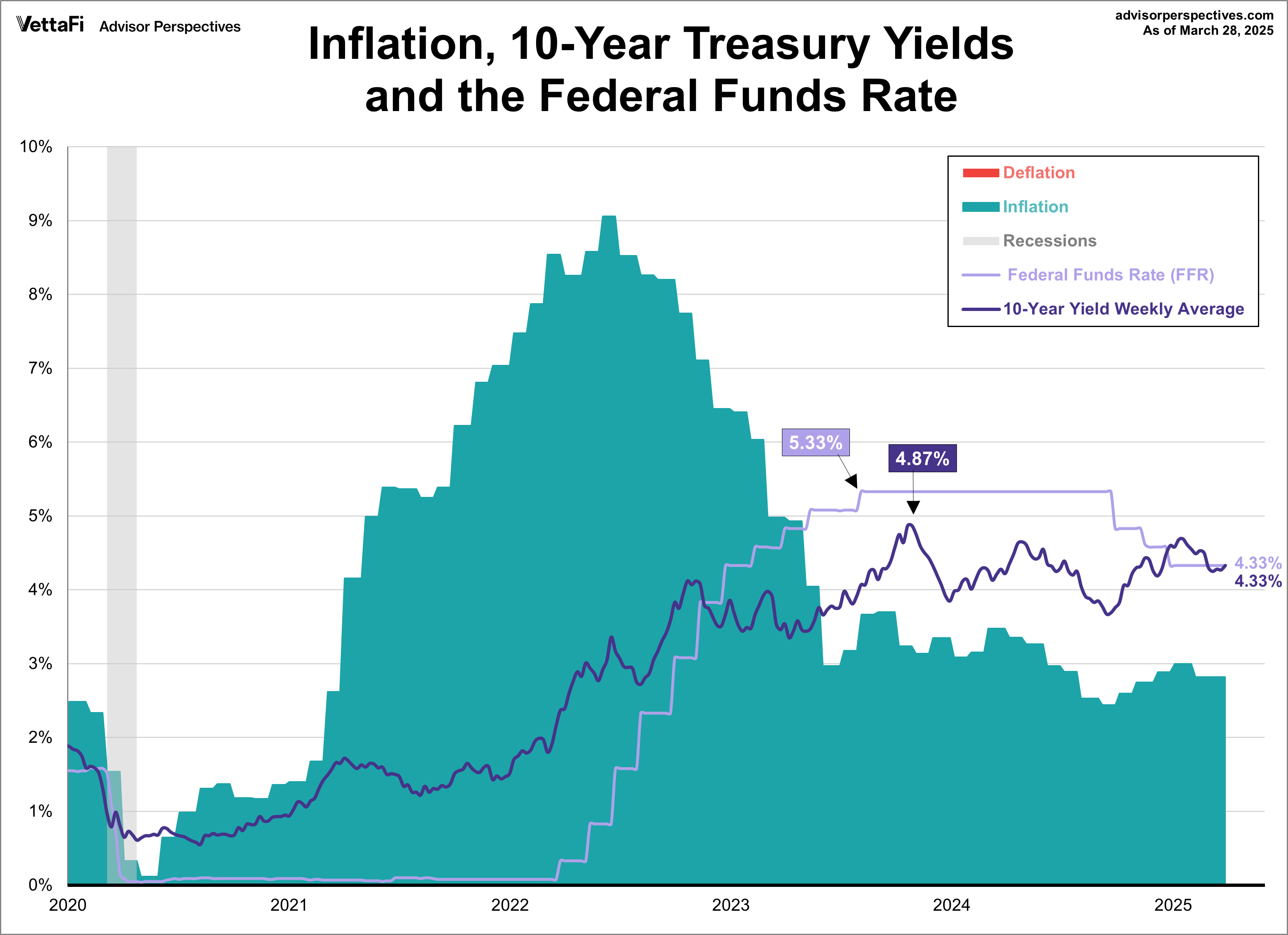
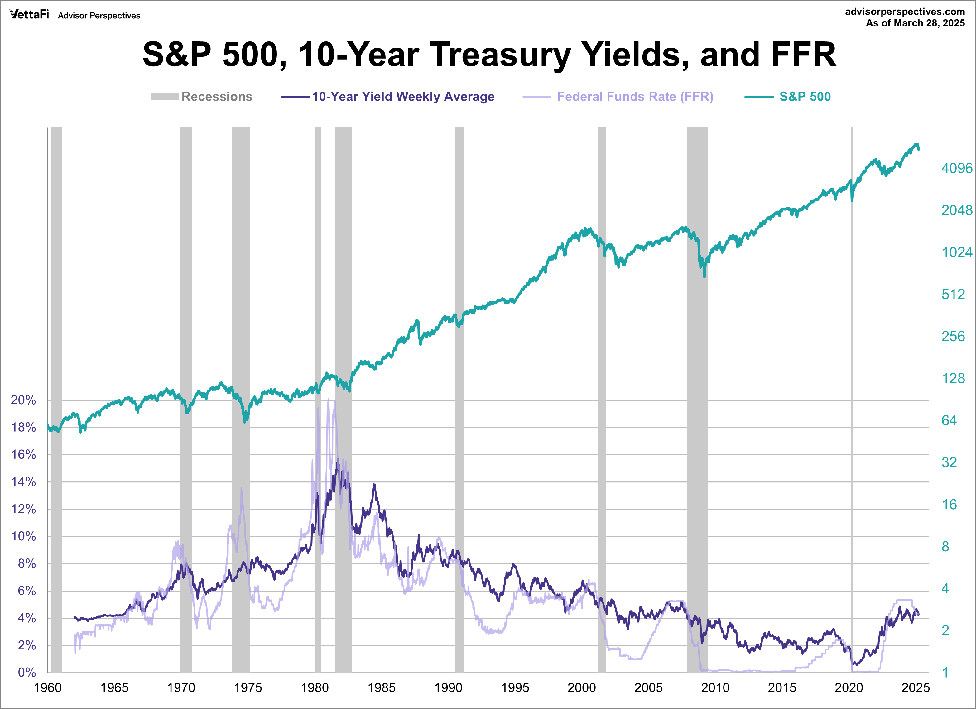
The 10-year Treasury yield has experienced dramatic fluctuations, ranging from a peak of 15.68% in October 1981, during the height of the Volcker era, to a historic low of 0.55% in August 2020, amidst the economic uncertainty of the pandemic. As of March 31, 2025, the weekly average stood at 4.33%.
The stagflation crisis of the late 1970s and early 1980s demanded drastic measures. Under the leadership of Paul Volcker, the Federal Reserve pushed the FFR to a historic high of 20.06% in January 1981. Nine months later, the 10-year yield’s weekly average hit a peak of 15.68% in October. This aggressive tightening of monetary policy was instrumental in curbing runaway inflation, albeit at the cost of a significant economic slowdown.
In stark contrast, the FFR was driven to near-zero levels in the aftermath of the 2008 financial crisis and again during the economic turmoil of the 2020 pandemic. Specifically, the FFR reached a record low of approximately 0.04% in May 2020. A few months later, the 10-year yield weekly average fell to a historic low of 0.55% in August. These periods of ultra-low interest rates aimed to stimulate borrowing, investment, and economic recovery.

What happened next was inflation reached its highest levels since the stagflation crisis previously mentioned. In response, the Fed began raising rates to fight inflation…some would argue their efforts were too late. From May 2022 to August 2023, the Fed quickly raised the FFR to its highest level in over 20 years. Meanwhile, the 10-year yield moved in similar fashion. The Fed held its rate steady for just over a year as inflation cooled from its 2022 peak. In September 2024, they began their rate cutting cycle. However, interestingly, while the FFR declined during the back end of 2024, the 10-year yield moved in the opposite direction. At the same time, inflation proved sticky and many continue to worry that it has stalled out above the Fed’s 2% target.
At the end of March, the 10-year yield weekly average stood at 4.33% while inflation was at 2.8%. The Fed is expected to continue cutting rates this year, with the market currently pricing in three 25 basis point cuts in 2025 starting at the June meeting as per the CMEFedWatchTool.
Treasuries vs. Equities
In our next chart, the S&P 500 is overlaid with the 10-year yield’s weekly average and the Fed Funds Rate. Generally, equities and treasuries tend to move in opposite directions. When one goes up; the other goes down. However, that’s not always the case. During inflationary periods, like the past few years, both move in tandem. This is due to the impact of higher interest rates on corporate profits and bond prices. The initial chart presents nominal values, meaning it doesn’t account for inflation. This can create a misleading picture of the actual purchasing power of yields and equity returns.
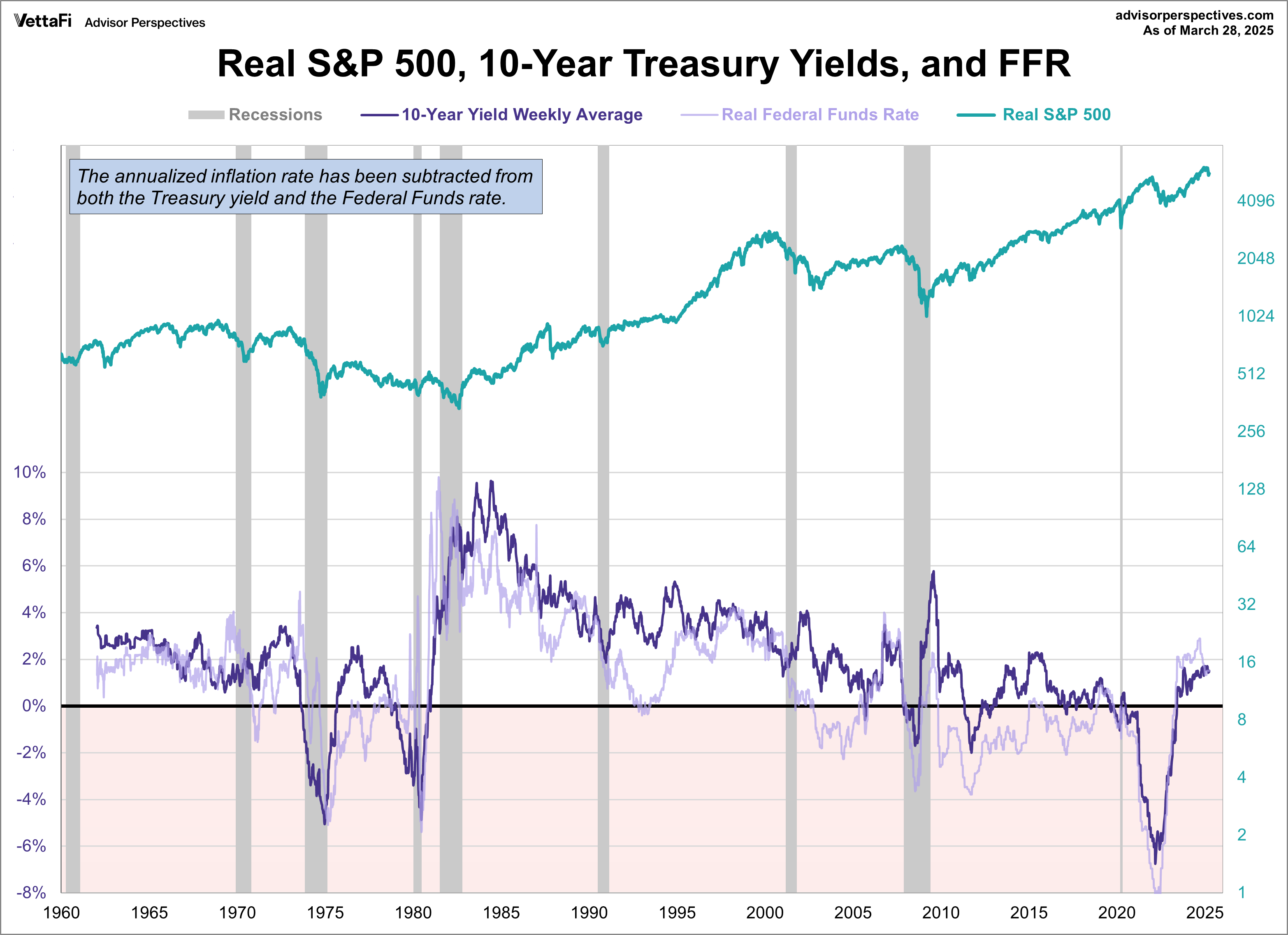
Here’s the same chart with the S&P 500 and 10-year yields adjusted for inflation using the Consumer Price Index (CPI). By adjusting the data for inflation, we gain a clearer understanding of the real returns. This adjustment reveals the severe impact of stagflation, particularly the significant decline in real equity values from the mid-1960s to 1982. We can also see why high yields can be deceptive in periods of elevated inflation. As evidenced by the stagflation from the 70s/80s and more recently from just a few years ago.
The FFR line offers valuable insights into the Federal Reserve’s monetary policy. We can see how the Fed has used rates to control inflation, accelerate growth and, when needed, apply the brakes. I’ve annotated the top chart with the tenures of the Fed chairmen so we can see who was managing the various FFR cycles since 1960.
Examining the FFR’s historical extremes—from the 20.06% peak in 1981 to the 0.04% trough in 2020—underscores the Federal Reserve’s capacity to implement dramatic policy shifts in response to prevailing economic conditions. In the early 1980s, the priority was taming inflation. In more recent periods, the focus shifted to preventing deflation and promoting economic growth.
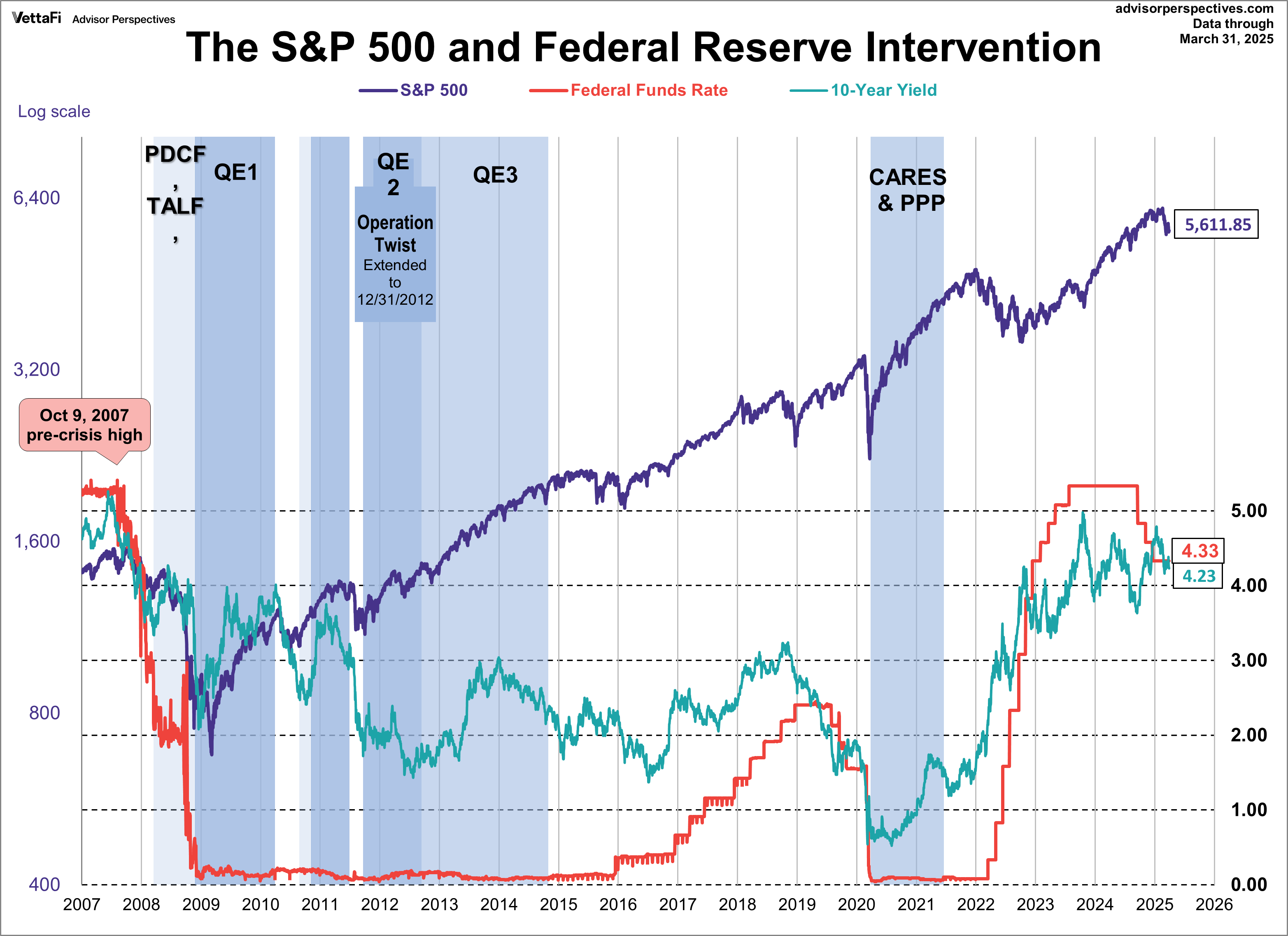
It’s not obvious that the Fed has done a great job stimulating the economy. However, even during periods of high interest rates, such as the late 1980s and the recent period of rates being at a 20 year high, the S&P 500 has demonstrated resilience and achieved record highs. Our last chart shows the 10-year yield’s daily closes against the S&P 500 with some notes on Fed intervention.
For a more frequent look, we update our Treasury Yield Snapshot on a biweekly basis.
ETFs associated with Treasuries include: Vanguard 0-3 Month Treasury Bill ETF (VBIL), Vanguard Intermediate-Term Treasury ETF (VGIT), and Vanguard Long-Term Treasury ETF (VGLT).
Originally published on Advisor Perspectives.
For more news, information, and analysis, visit the Fixed Income Channel.
Financial Market Newsflash
No financial news published today. Check back later.


